event marketing cloud blog
Modern & Responsive
By Lenos Professional Services Team
March 2017
Amazing on all devices
A responsive website detects what type of device your attendees and prospects are using – a smartphone, a tablet, or a desktop computer. It then responds automatically, adjusting to different screen size of the device, delivering a streamlined experience for mobile and desktop users alike. No more pinching or horizontal scrolling required.
…and there is no denying the popularity of mobile devices:
Excellent User Experience
For online customers, a website’s functionality and professional appearance is a priority. Fast, functional, and designed to look great on any device, a responsive website provides the best user experience possible and a contemporary layout.  Adopting Responsive websites is thus about providing the optimal user experience regardless of the device they use to view it.  
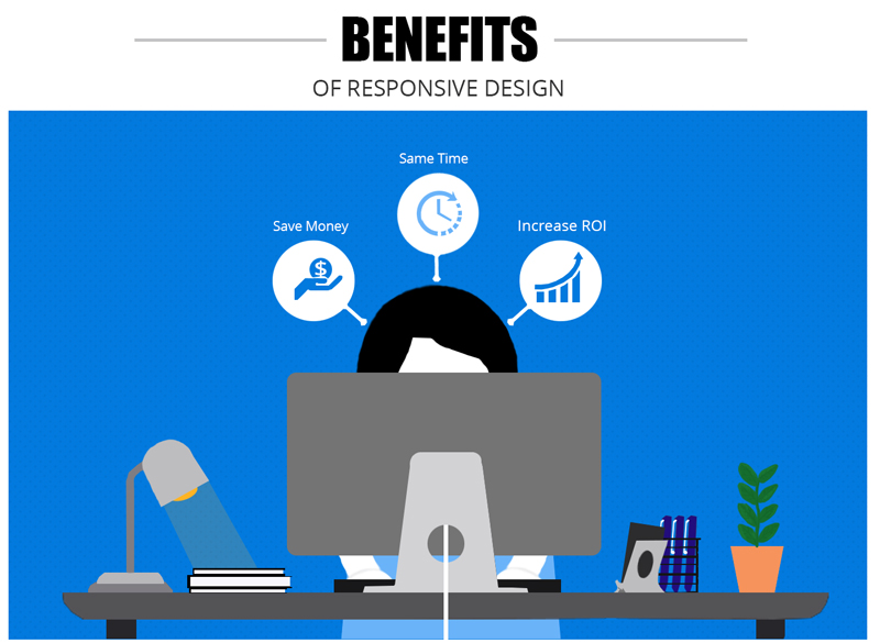
Saves Time, Effort and Money
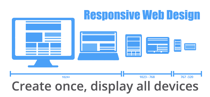
A responsive web design (RWD) site also make life easier for you.  A “design once, display all devices” approach is efficient, and will save on having to create (or purchase) a separate mobile app.  Technically, a RWD site layout adapts based on using fluid, proportion-based grids, flexible images and CSS3 media queries. It’s easier than it sounds.  Think of site layouts based on rows and containers. In addition to being more efficient to create a RWD site, it also makes it infinitely easier to edit and make continuous update while displaying to all devices seamlessly.  No more disconnects between your website and your mobile app, and the savings can be substantial.  You also don’t need to maintain two separate systems – your web site and your mobile app.  Responsive web designs also enhance your SEO efforts by having all your visitors directed to a single site no matter what they prefer to use as a device.
Search Engines Also Prefer Responsive Websites
Mobile-friendly websites are given precedence by Google, Bing, and other major search engines because they offer a better user experience. If your goal is to increase attendance for public corporate events through better search rankings, you need a site that adapts to every screen size. Responsive web design ensures therefore that your business is fully optimized for search engines, helping you to reach more customers on the web. 
Easy to Manage
Managing one site for all devices is far easier.  When you make an edit to the site it automatically is available on all devices. No more disconnects between your website and your app on Agenda or Sessions updates. Best yet, all your data is also in one place to ensure you can easily access all registrant information in one report.