event marketing cloud blog

Date: January 2018 | By Fred Kersting, the Founder and President of Innovent
 
Date: March 2017 | By Lenos Professional Services Team
 
A responsive website detects what type of device your attendees and prospects are using – a smartphone, a tablet, or a desktop computer. It then responds automatically, adjusting to different screen size of the device, delivering a streamlined experience for mobile and desktop users alike. No more pinching or horizontal scrolling required.
One Solution

Design once, Display all

One Solution: from invites to content, registration, confirmations and responsive mobile.
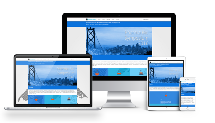
Design once, display all: A responsive website detects what type of device your attendees and prospects are using --- a smartphone, tablet or a desktop computer and responds automatically for each device.
Interview with Patti Tackeff, Lenos President
Date: February 2010 | By Alison Hall
 
“There’s money to be made in the data trade, and the meetings industry has not been held to strict data privacy standards. The European Union’s General Data Protection Regulation may change this and even change how buyers approach supplier sourcing and contracting.”